Open Extended Reactions
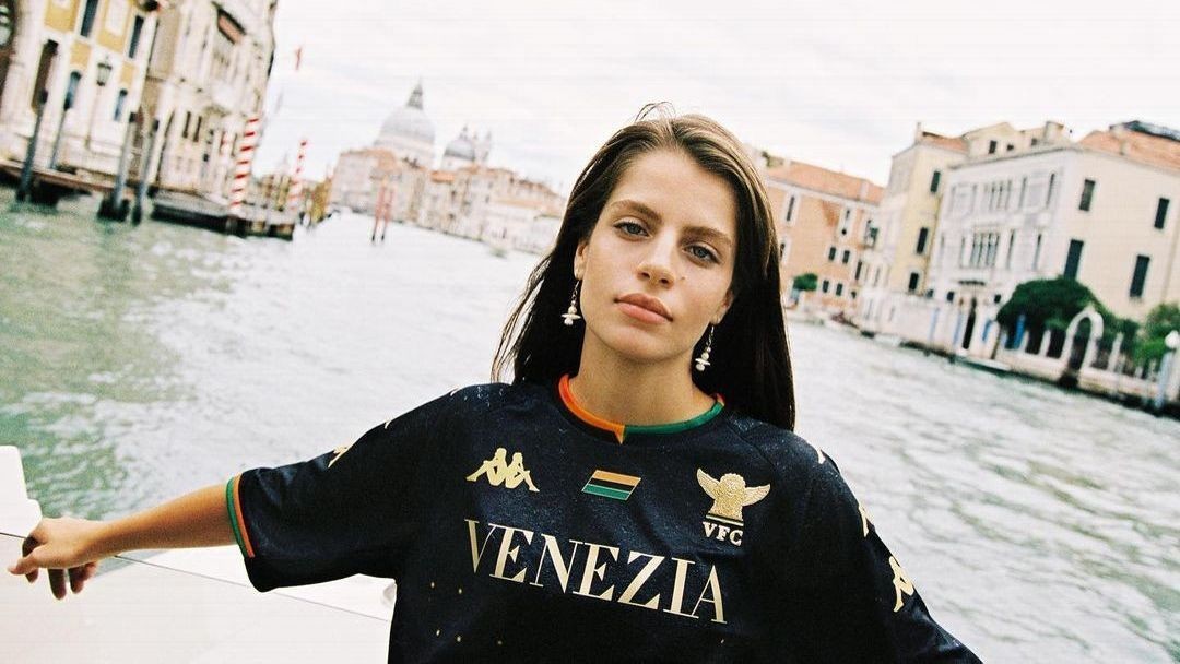
Italian club Venezia have consistently been one of the most stylish sides in European football in recent years, producing a string of gorgeous jerseys that effortlessly blend fashion and football.
The shirts themselves were designed in conjunction with the club by creative agencies Bureau Borsche and Fly Nowhere, then made by Italian sportswear manufacturer Kappa. They were then launched with luxurious photoshoots like those you'd find on glossy magazines, staged in glamorous Venetian settings; from ancient cloisters to canals to azure coastal lagoons.
However, following the conclusion of the 2023-24 season, club president Duncan Niederauer said: "As for the technical sponsor, we have decided to proceed with a new partnership that we will present at the end of the summer, together with the new brand ambassador, at the launch of the 24/25 jerseys, all already designed by our team."
Editor's Picks
- Inspired by Africa: Arsenal unveil amazing 2024-25 away kit5dChris WrightBarcelona's new home kit is a classy way to mark club's 125th anniversary5dChris Wright
1 Related
Kappa's partnership with Venezia ran for just three seasons, but nonetheless they graced us with a collection of some of the most refined, stylish football shirts of the modern era.
With the club winning promotion back to Serie A, let's hope that they can continue to bring their uniquely haute-couture style to the Italian top flight next season.
Here we rank all 10 of the home, away and third alternate outfield kits produced by Kappa for Venezia. Così bello!
10. Third kit, 2021-22
View this post on Instagram
Well, one of them had to be last. The "Lagoon shirt" was arguably the least chic of Kappa's inaugural batch. The aquatic blue base was designed to conjure images of the Adriatic Sea, and particularly the famous Venetian Lagoon, with the club colours rising from the water to "float" on the surface. Unfortunately, the finished design was a tad more cluttered than it needed to be.
9. Third, 2022-23
View this post on Instagram
Treading the very finest of lines between resplendent glow and all-out gaudiness, this shirt was conceived as a visual metaphor for Venice's rich history of ostentatious art and lucrative commerce. Looking like something a particularly daring referee might wear, the all-gold shirt veers dangerously into the garish. but the large black collar and logos odd just enough contrast.
8. Home, 2022-23
View this post on Instagram
The first jersey released after they were relegated from the top flight, the bands of orange-and-green trim are used sparingly but really stand out against the all-black template.
7. Fourth, 2021-22
View this post on Instagram
A luxurious deep red jersey with black and gold accents that was inspired by the regal "Stendardo di San Marco", which, replete with golden lion and lavish fringes, served as the flag of the Republic of Venice until its dissolution in 1797. The highly ornate pattern in the fabric is also a nod to the countless elaborate mosaics found on the floors of historic buildings throughout the city.
6. Away, 2021-22
View this post on Instagram
Kappa deployed the Arancioneroverdi's traditional colours to full effect here, with an off-white shirt used as a base for an unusual orange-to-black-to-green gradient that spread across the torso. The lower part of the jersey was also broken up with a sharp triangular graphic inspired by Venice's long history of mosaic art and decoration.
5. Home, 2023-24
View this post on Instagram
Venezia served up another pearl for 2023-24 with the home shirt once again decked out in black and gold with orange-and-green trim present in a narrow, two-toned strip running front and centre from collar to hem. Unusually, all the logos and crests were aligned vertically on the left-hand side. The grandiose shirt was inspired by architect Carlo Scarpa, who helped to renovate and modernise many buildings and bridges in Venice, and, in particular, his "delicate combination of craftmanship and design". Who are we to argue?
4. Away, 2023-24
View this post on Instagram
With the strands of football and lifestyle continuing to intertwine, Venezia unveiled another immaculate white away shirt for the 2023-24 campaign with all the hallmarks that by now had become familiar. The defining feature this time round was a contrasting block of orange and green placed artfully toward the lower hem. The shirt was introduced as an homage to local legend Arrigo Cipriani, author and proprietor of the legendary Harry's Bar, which has been a jewel in Venice's cultural crown since the 1930s. The then-90-year-old Cipriani also appeared in the launch video, looking every inch the dapper bon vivant as he cruised aboard his boat across the Venetian Lagoon.
3. Third, 2023-24
View this post on Instagram
Undoubtedly the most creativel embodiment of the city, this jersey was inspired directly by the famous striped uniforms worn by the gondoliers of Venice. The black and white bars are topped off with an exquisite contrasting red collar. In fact, all that was missing was the traditional straw boater hat to top it all off.
2. Away, 2022-23
View this post on Instagram
Dripping with poise and panache, this jersey proved to be an instant classic. The light cream base, alternating green and orange horizontal stripes and embossed gold details proved irresistible to the footballing fashionistas of the world -- and with good reason.
1. Home, 2021-22
View this post on Instagram
The first offering from Kappa was a classy, slick design with an orange-and-green quartered collar and an array of golden stars (as found on St Mark's Basilica) arranged to form a large "V" on the midriff beneath a capitalised print of the word "Venezia", which actually served as the club's official logo during Serie A games meaning its modernised "winged lion" crest had to be removed during league fixtures. As a little bonus detail the chalky, mottled effect found on the shirt's black base was actually modelled using textural photographs of the ancient stone walls that still stand around the city.
Source: espn.co.uk

